Showing posts with label original art. Show all posts

Tuesday, March 19, 2013

Vintage Marbles


Vintage Marbles
Oil on Masonite Panel  6X6

Time to get back to painting.  It seems that since the holidays, there has been a steady (but VERY welcome) stream of house guests!  Now I need to put painting time back into my regular schedule.  I have plenty of new art supplies to keep me busy.  I stocked up on canvas of all sizes and lots of masonite panels- along with a good supply of watercolor paper.  No excuses.

The painting above is a small part of the jar of marbles my mom has from her childhood.  It is times like this that I am so happy that my grandparents had a basement AND the desire to keep so many of these little treasures from long ago!

Tuesday, August 21, 2012

Roadside Americana #2- Fresno Motel

Fresno Motel
Oil on Masonite 8X10

This is the second painting in my Roadside Americana- Vintage Neon series.  I am doing some in watercolor and some in oil.  Hopefully, I will be able to decide which media I like best for this particular set.  Maybe both, depending on the sign.  I am doing this same sign in watercolor now, so I will be able to compare.  
This particular motel sign is still visible from the freeway in Fresno.  I see it often when I am driving into town.  The funny thing is, I used to just ignore these awesome signs.  I guess I just didn't think they were going to start disappearing.  There is an awesome old neon sign that I drive by several times a week here in Ventura.  The Wagon Wheel Motel (actually in Oxnard).  The sign remains and I have taken photos, but the motel was long gone before I moved here.  It will definitely be on my short list of signs to paint and I hope to get to it soon!

Thursday, August 9, 2012

Painting Roadside Americana- Vintage Neon

Shell Beach Inn   8X10 Oil on Masonite

I haven't been getting a lot of painting time in lately, and have been painting in spurts instead.  I am trying to alternate between oils and watercolors when I do have time.  This week is an oil painting week.  I just got a great package of  art supplies in the mail- including a stack of masonite panels.  I love to paint on masonite since the paint just glides over the surface and it makes it easier to get those fine details.  Canvas is great, but the texture can make it tough to paint the smaller details.

I am not sure when it happened, but most of the great neon signs that we used to see along the roadside are just gone.  I have become a bit obsessed with these retro neon signs and take photos of them whenever I do see them.  They are my kind of painting subject- full of great detail and history.  Sometimes, the more beat up they look, the better.  This one is great looking, and far from worn out- maybe it isn't even that old.  Don't care- love the look.  

The Shell Beach Inn is in beautiful Pismo Beach, California.  I have not stayed there, but love the sign. We spent Fourth of July in Pismo and had a great time so this seemed like a good place to start painting my set of neon signs!  I apologize for the image quality here, the painting is too wet to scan yet, and this is just a photo.  Will post the scan soon!  

Friday, June 29, 2012

New Watercolor : Childhood Skyline Memories


Childhood Skyline Memories
9X12 Watercolor

We moved to Long Island in 1993, when both of our boys were  very young.  The first thing we did, was go to New York City- and take the trip out to the Statue of Liberty.  No matter how many times you see it, the Statue is an awesome sight!  
This watercolor is painted from a photo I took that day of the boys looking back at the New York skyline from Liberty Island.  Looking across New York Harbor, you see Ellis Island and the fantastic skyline of New York City. No matter how many photos I have taken since (and there are thousands) this is one of my very favorites.  One reason is that it reminds me of three things-

1. our big move from California to New York
2.  how much fun raising 2 little boys can be
3. how glad I am that we got to see the skyline as it was-
including the Twin Towers

Friday, June 8, 2012

California Dreamin' - Vintage Travel Trailer on Beach Watercolor

California Dreamin" 9X12 Watercolor

When we love to drive along the Pacific Coast Highway, between Santa Barbara and Santa Monica.  It is a beautiful stretch of California coastline and the view is amazing!  One of the main things we notice is that, no matter the time of year, the road is always lined with campers and trailers.
They are often parked only a few feet apart, side-by-side and end-to-end.  There is a wonderful variety of styles in these groupings- from new and shiny to the old and vintage style.  My favorites are the vintage trailers- unfortunately, that shows my age!  They remind me of when I was growing up and bring back nice childhood memories.  Some of these vintage trailers are really restored and creatively styled.  This watercolor is not a painting of a specific trailer I have seen- more a painting of a trailer I put into a fun beach setting.  It was a blast to paint and those are my favorite paintings, the ones that are all fun and no problems!

Tuesday, May 29, 2012

17- Mile Drive, Pebble Beach Oil on Canvas

17- Mile Drive    Oil on Canvas 15X30

I finished this painting a while ago and I'm just getting it posted.  The view along 17- Mile Drive is absolutely beautiful, and we have been there many times.  Last time we were there, I took lots of photos to use as reference photos.  The photo I used for this painting was actually four separate photos that I merged together to get this panoramic view.

Monday, May 21, 2012

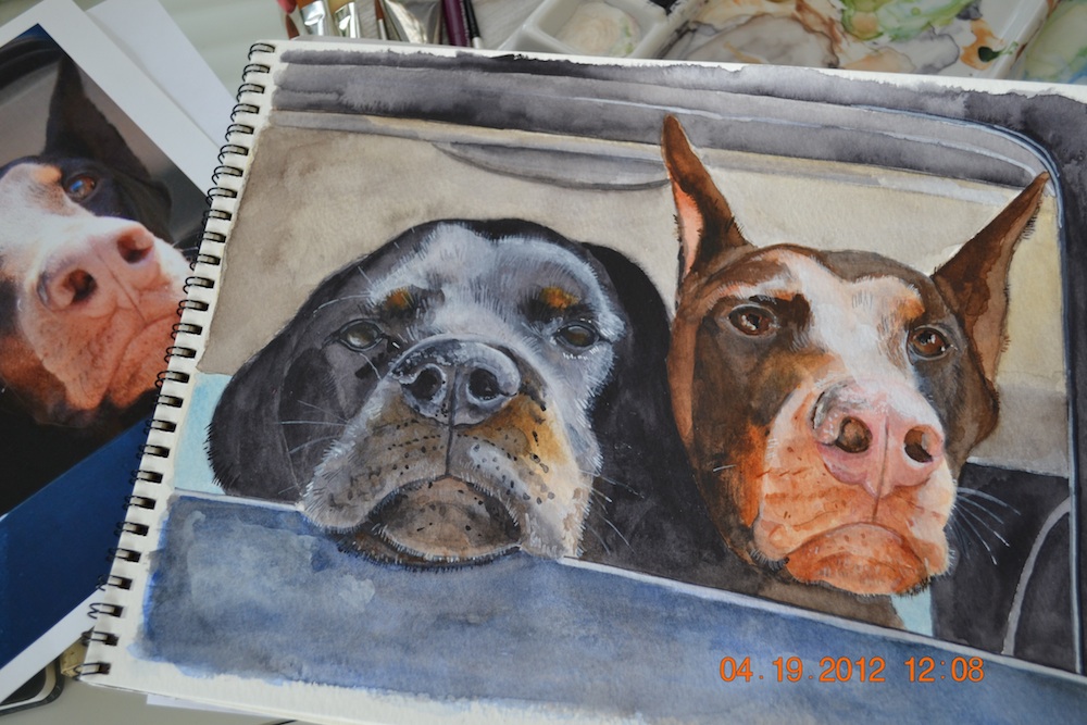
Ben's Dogs- Watercolor


Hurricane & Berserker
watercolor 9X12

I have had some family things going on lately and was away from home much of the time- so not much painting being done.  I have managed to fit in a few new paintings, and this is one of them.  My daughter in law posted a photo of their sweet puppies on Facebook and I knew I had to paint them.  They were in the car waiting to be let out to play- I just loved the faces and the way the sun was shining on them.  They aren't actually puppies anymore, but that is how I think of them.  They are both "scary" breeds, but couldn't be sweeter!  Now I find myself in the mood to paint more dogs- maybe another watercolor of my own sweet standard poodle.


Friday, January 27, 2012

Scallop Shell Trio Watercolor

Scallop Shell Trio- 9X12 on 140 lb. cold press

I am in a beach painting state of mind lately, and the shells and beach glass are getting me back in practice.  I decided that the easiest way to get back to painting would be with the simple objects- and beach finds are something I have in abundant supply.  The variety of colors and all of the little details make for good practice without a lot of pressure to produce a perfect painting.
These scallop shells are from Long Island- Fire Island to be specific.  Walking the beach on Fire Island is amazing when you are a serious beachcomber.  One beach has mostly clam shells, and a mile down the sand, there are zillions of scallops.  If you are having a GREAT day, you find some beach glass to add to your sandy treasures.
I found a new beach today(new to me) that was beautiful, but not much in the way of shells.  Right in the shadow of Mugu Rock, next to Point Mugu Naval Base.  I found a few pretty little shells and 4 pieces of beach glass.  A little extra exercise to add to my 3 miles at sunrise- along with some nice photos made it a good trip.  Who knows? Maybe a future painting in one of those photos.


Wednesday, January 25, 2012

Beach Glass Watercolor - 9X12


Beach Glass Watercolor
140 lb cold press- 9X12

beach glass detail

I am really trying to get back into a painting routine, and think I have finally gotten a start.  I haven't painted much at all since starting the moving/relocation process and I am definitely ready for some creativity!  About a week ago, I got out my palette, and a pad of watercolor paper and got nowhere.  Sometimes, I think the most difficult part of painting is thinking of WHAT to paint and getting focused.  Yesterday I sat down with a plan to just paint a few small watercolors and to paint things I enjoy painting.  Well, with a pile of beach glass and sea shells in front of me- it worked!  Sometimes, artistic mojo and too much thinking just don't mix.  After I relaxed and didn't worry about painting a masterpiece- I just had fun.  Now to find (and keep) my artistic mojo- wherever it may be.


Sunday, June 19, 2011

Back to the Beach

"Catch of the Day"
9X12 acrylic on canvas


We are moving soon. That means lots of things to pack, which is bad.  It also means I will be a few feet from the sand and the Pacific Ocean, which is excellent!  I am only about an hour from the coast now, but an ocean view is much better.  When we left Long Island, I knew I would miss the beach being only a few minutes away.  I definitely have missed the frequent trips to Fire Island, and it will be wonderful to live on the coast again (not to mention saying bye bye to the 100+ degree days of summer here).

Tuesday, June 14, 2011

Vintage Baby Shoe

9X12 Watercolor on 140 lb cold press paper

I had so much fun painting my boys' baby shoes that I wanted to continue with the same idea a bit longer.  My mom gave me hers to paint, and also my own.  Then, I will probably move on!  Sometimes, I just get into a fun painting groove and like to stick with it.  I did take a break from the shoes to paint the baseball watercolors, so its not really an obsession yet. I also love the idea that my mom wore this shoe in 1936- a fact she might not love me advertising, along with calling this a "vintage baby shoe".  Nothing to worry about, Mom- my baby shoes are also vintage!


Friday, May 13, 2011

WIP "Mosquito Lake" Oil Painting

oil on canvas 12X16

reference photo

Mosquito Lake is a beautiful lake up in Northern California on the way to Lake Tahoe.  The lake is on Ebbetts Pass in the Sierra Nevadas at about 10,000 ft. elevation (Alpine County). It is one of our favorite day trip destinations.  It seems that every time we go there, the water is perfectly still and makes for perfect photos!  I have been meaning to paint this for months and finally got to it.  I am working on it in my painting class and should be done with it this week.  I have to add some more details and glaze in some more darks at the shoreline, but it is almost finished.  When it is completed, I will post some photos of the start-to-finish progress.

Wednesday, April 20, 2011

Wine Cork Watercolor- Parador "Castle"


I haven't gotten any painting done and realized it has been a week since my last post!  I have been waiting for my face to stop hurting after an especially "uncomfortable" 3+ hours at the dentist last Friday.  I was going in for an extraction and thought I'd be a little uncomfortable for a day or so and back to painting. Wrong.  Be very wary if you ever need to have a tooth pulled that has had a root canal.  Brittle roots- need I say more?

I did this cork watercolor a few weeks ago for #47 in my 100 Paintings Challenge.  I love the castle stamped on the cork.  I don't know if it represents the winery or another castle, but I loved it.  It is always a surprise to get a great cork, since you can't see it until you have opened the bottle.  I haven't been to this winery yet, it was a nice delivery from our Napa wine club.  The wine was very good, so it isn't all about the great cork!  Just a bonus if you are an artist with a thing for painting corks.

Thursday, April 7, 2011

Displaying Our Artwork- When does "just enough" become too much?


I have some recently finished paintings to hang.  My dilemma is a recurring one for me.  Are my walls too full of art already?  The thing is, when I finish a painting, hopefully I like it.  But I like the ones that are already being displayed on my walls also!  Most of my paintings have memories attached for me... places I have visited... such as Paris, Italy, the beach, etc.  The paintings, like a photo album or scrapbook, bring back memories.  It would be easy if I just took down the older paintings to add the new ones.

One of my art blogger friends, Pat, showed some of her walls with paintings recently and it got me thinking.  Who better to get feedback from than fellow artists who may go through the same problem with art display!  As you can see from the third photo, I have a batch of newly framed paintings (oils) waiting for me to decide where they will go.  I am not a speed painter, these were finished over a period of time and just needed framing.  I found some frames I love- plein air frames with gold or silver leaf- so, now they are ready to go up.  The wall in the top photo goes up another 10-12 feet and my husband and I thought we might just continue to hang them higher up the wall.  I am lucky in that my husband does not think there can ever be too many paintings on the walls and keeps pointing out blank spots.  Magazines and TV always seem to be showing me rooms with empty walls or maybe one or two paintings. That is simply not going to happen at my house.  So- my question is this- what do you do, rotate your art, just stop framing?   I am not going to stop painting any time soon, so our supply of artwork won't suddenly dry up!  I have been sharing with family and friends for years as gifts, and whenever I am lucky enough- I sell them...
Thank you so much for your input-
Sheryl

Wednesday, March 30, 2011

Wine Bottle Watercolor


Watercolor and ink on 9X12 140 lb cold press paper

When I saw this wine bottle on the store shelf, I knew I had to at least try to paint it.  How could I resist?  So fun and colorful and full of tiny details.  Well, there were quite a few times when I almost just gave up thinking I had taken on too much.  There were details on the label that I hadn't even noticed until I started to paint!  The artist that designed this label is so talented.  As usual, when I took a few steps back from the watercolor, I liked it more than up close.  I need to do that more often- when we paint we are too close to the painting to really look at it.  I left out a few of the tiniest details and that was the key- knowing when to stop.  I did decide to add the wine glass when I was finished with the bottle and it seemed to need something else.  When I added the ink outlining (on the label) with my rapidograph, it really helped make the details stand out.
This was one of those times that leaving the background white seemed right to me so I just added the shadows.
I forgot to mention the bonus- the wine IN the bottle was really quite good.  I was buying the bottle anyway- it wasn't the least bit important to me how good the wine was.  Sometimes, it is just about the label.  The cork was even worthy of painting, with the elephant on the end!

Sunday, March 20, 2011

"Cape Disappointment" 18 X24 Watercolor

Cape Disappointment 18X24 Watercolor

Seaside and beach scenes are among my favorites to paint, and although they are usually photos I have taken- this one is not.  I saw it in a magazine quite a few years ago and really wanted to paint it.  This beautiful place is called Cape Disappointment and is located on the coast of Washington where the Columbia River empties into the Pacific Ocean.  I just know this is a place I could live!

I know I have just drawn 2 new watercolors that are ready to paint, but I got sidetracked and wanted to finish this one.  I have quite a few unfinished watercolors on the end of my painting table in my studio and, sometimes, I am in the right mood to actually finish one or more.

Thanks for visiting!

Tuesday, February 15, 2011

Watercolors- Ready for Summer!


Can you tell I am ready for summer to get here?  Where I live (in a valley in California) we get hit with foggy days much of the winter.  I don't mean hazy fog.  I am talking about the kind of fog they use in creepy movies.  The kind of fog that means you can't see 5 feet into your yard.  No sun for days.  Well, we saw the sun the other day and now I got a taste of what is coming- just not soon enough! I opened up windows to get some fresh air in the house after a winter of being closed in with the heater running.  
So, now I am already planning my first trip to the nursery-first of many.  I can't wait to start spending days in the garden- even though the first days will be spent doing all the dreaded spring clean-up and pruning away dead branches.  And, of course there will be the beach days!  
I am dealing with my Spring Fever by painting the beach.  I have said it before, but here it is again- I miss Long Island's beaches!  We have nice beaches here in California also, but the main problem is that they are more like an hour away now instead of the 15 minute drive on Long Island!     

Tuesday, February 8, 2011

Watercolors- Trip to Paris


After spending the last week painting with oils, I took some time for watercolors.  I am doing The 100 Painting Challenge (http://www.100paintingschallenge.com/) and my understanding is that we should stick to one medium- and I started with watercolor.  These are #25 and #26 of my 100, so I need to keep up with them.  I love working with oils also, so I tend to go back and forth between the two mediums- mixing in some acrylic paintings along the way.  
The reference photos for these watercolors  were taken during a fun week in Paris a few years ago.  My husband was there on business, so I had some time to wander around and take pictures while he was working.  There are bakeries and pastry shops (boulangeries/patisseries) on every street like the ubiquitous delis and bagel shops on Long Island.  Lucky Long Islanders.  I loved looking at all of the beautiful and delicious (I sampled more than a few) items in the display cases!  I am sure they thought I was crazy for taking pictures of these tasty treats, but everything is a possible future painting- something my fellow artists would agree with.  The photos for these were taken on the Rue St. Dominique and Rue Cler-  two of my favorite places of the many wonderful areas in Paris. 


Thanks for stopping by!


Friday, February 4, 2011

Cherries Painting- Oils on Masonite


Finally got a good photo (actually a scan) of the finished cherries. I had a lot of trouble since the finish is reflective and I kept getting glare with my photos even with the flash off. So much for taking a quick photo to post! Fortunately, my scanner has a professional mode and definitely gave me a perfect image. There isn't much difference in the two photos, I just put some final touches on the glass to give it more of a shine- but it was definitely worth it!
Thank you for visiting and for any (much welcomed) comments-
Sheryl

Thursday, January 27, 2011

Seashell Trio- oils on canvas


I am finishing, one at a time, the oil paintings that I started earlier this week. Sometimes I find I get more done by starting a batch of paintings at once. If I prime multiple canvases, they are then ready to go and easy to start. No excuses. Painting on these small canvases is so fun, too!

The dark still life starts out on a canvas covered in dark (usually black) acrylic paint. It is faster and uses less of my more expensive oil paint. Then, I can mix my darks for the background- usually alizarin crimson, burnt umber, and ultramarine blue. For the beach/sand paintings, I usually start with a raw sienna mix. Then come the grains of sand, then the shells and beach glass. Some of my shells and fruits (cherries, pomegranates, etc.) get a pure black background to make them really stand out.

Time to go paint- I have more than a few paintings waiting in my studio!
Thanks for visiting-
Sheryl